

Explore LAT Data
It is recommended that the user first gain some basic familiarity with the structure and content of the LAT data products, as well as the process for preparing the data by making cuts on the data file. This tutorial demonstrates various ways of examining and manipulating the LAT data, but it is a simple approach useful for quickly exploring the data. In almost all cases, lightcurves and energy spectra need to be produced by gtlike for robust results.
In addition to the Fermi Science Tools, you will also be using the following FITS File Viewers:
- ds9 (image viewer); download and install from: http://hea-www.harvard.edu/RD/ds9
- fv (view images and tables; can also make plots and histograms;
download and install from: http://heasarc.gsfc.nasa.gov/docs/software/ftools/fv
Data Files
Some of the files used in this tutorial were prepared within the Data Preparation tutorial, and are linked here:
- 3C279_region_filtered_gti.fits (8.0 MB) - a 20 degree region around the blazar 3C 279, with appropriate selection cuts applied
- spacecraft.fits (58.8 MB) - the spacecraft data file for 3C 279
- grb_events.fits (128 kB) - a 40 degree region around GRB 080916C (trigger time = 243216766 MET)
- grb_spacecraft.fits (52 kB) - the spacecraft data file for GRB 080916C
The grb_events.fits and grb_spacecraft.fits files were selected from the LAT data server using the following criteria:
- Search Center (RA,Dec) = (121.8,-61.3)
- Radius = 40 degrees
- Start Time (MET) = 243216266 seconds (2008-09-16T00:04:26)
- Stop Time (MET) = 243218266 seconds (2008-09-16T00:37:46)
- Minimum Energy = 20 MeV
- Maximum Energy = 300000 MeV
Alternatively, you can select your own region and time period of interest from the LAT data server and substitute that. Photon and spacecraft data files are all that you need for the analysis.
1. Exploring the Data
In this section we look at several different ways to explore the data and make quick plots and images of the data. First, we'll look at making quick counts maps with ds9; then we'll perform a more in depth exploration of the data using fv.
ds9 Quick look:
To see the data use ds9 to create a quick counts maps of the events in the file.
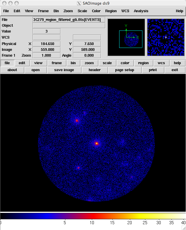
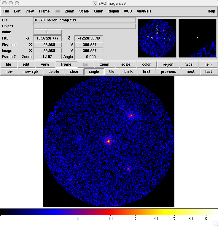
For example, to look at the 3C 279 data file, type the following command:
prompt> ds9 -bin factor 0.1 0.1 -cmap b -scale sqrt 3C279_region_filtered_gti.fits &
A ds9 window will open up and an image similar to the one shown below will be displayed.
 Breaking the command line into its parts, we find that:
- ds9 - Invokes the command.
- -bin factor 0.1 0.1 - Tells ds9 that the x and y bin sizes are to be 0.1 units in each direction. Since we will be binning on the coordinates (RA, DEC), this means we will have 0.1 degree bins.
Note: The default factor is 1, so if you leave this off the command line you will get 1 degree bins
- -cmap b - Tells ds9 to use the "b" color map to display the image. This is completely optional and the choice of map "b" represents the personal preference of the author. If left off, the default color map is "gray" (a grayscale color map).
- -scale sqrt - Tells ds9 to scale the colormap using the square root of the counts in the pixels. This particular scale helps to accentuate faint maxima where there is a bright source in the field as is the case here. Again this is the author's personal preference for this option. If left off, the default scale is linear.
- & - backgrounds the task, allowing continued use of the command line.
Exploring with fv:
fv gives you much more interactive control of how you explore the data. It can make plots and 1D and 2D histograms; allow you look at the data directly; and enable you to view the FITS file headers to look at some of the important keywords. Starting it up is easy, just type fv and the filename:
prompt> fv 3C279_region_filtered_gti.fits &
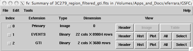
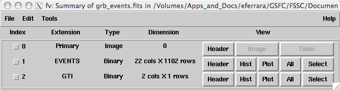
 This will bring up two windows: the general fv menu window (at right); and another window shown below, which contains summary information about the file you are looking at:
For the purposes of the tutorial, we will only be using the summary window, but feel free to explore the options in the main menu window as well.
Looking at the summary window, notice that:
- There are three FITS extensions (primary, EVENTs & GTI). This is what should be there. If you don't see three, there is something wrong with your file.
- There are 89804 events in the filtered 3C279 file (the number of rows in the EVENTS extension), and 22 pieces of information (the number of columns) for each event.
- There are 3680 GTI entries.
From this window, data can be viewed in different ways:
- For each extension, the FITS header can be examined for keywords and their values.
- Histograms and plots can be made of the data in the EVENTS and GTI extensions.
- Data in the EVENTS or GTI extensions can also be viewed directly.
Let's look at each of these in turn.
Viewing an Extension Header:
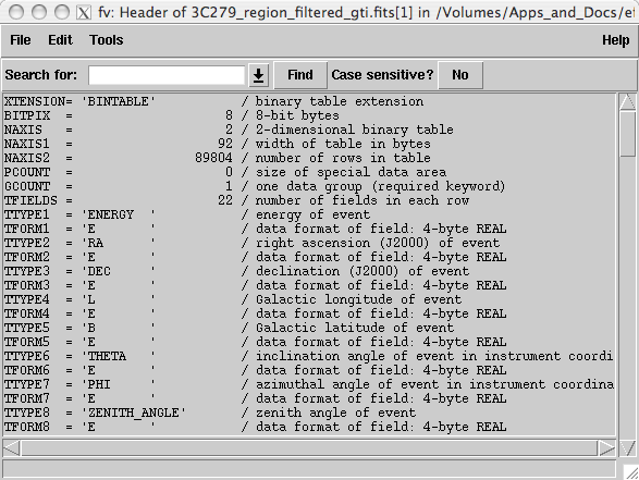
Click on the ![]() button for the EVENTS extension;
a new window listing all the header keywords and their values for this
extension will be displayed. Notice that the same information is
presented that was shown in the summary window; namely that: the data is
a binary table (XTENSION='BINTABLE'); there are 89804 entries
(NAXIS2=89804); and there are 22 data values for each event (TFIELDS=22).
button for the EVENTS extension;
a new window listing all the header keywords and their values for this
extension will be displayed. Notice that the same information is
presented that was shown in the summary window; namely that: the data is
a binary table (XTENSION='BINTABLE'); there are 89804 entries
(NAXIS2=89804); and there are 22 data values for each event (TFIELDS=22).
In addition, there is information about the size (in bytes) of each row and the descriptions of each of the data fields contained in the table.
As you scroll down, you will find some other useful infomation as shown in the screen shot below:
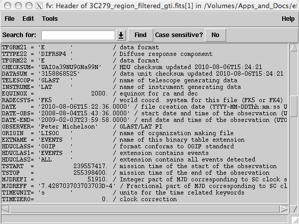
There are some fairly important keywords on this screen, including:
- DATE - The date the file was created.
- DATE-OBS - The starting time, in UTC, of the data in the file.
- DATE-END - The ending time, in UTC, of the data in the file.
- TSTART - The equivilant of DATE-OBS but in Mission Elapased Time (MET). Note: MET is the time system used in the event file to time tag all events.
- TSTOP - The equivilant of DATE-END in MET.
- MJDREF - The Modified Julian Date (MJD) of the zero point for MET. This corresponds to midnight, Jan. 1st, 2001 for FERMI.
Finally, as you scroll down to the bottom of the header, you will see:
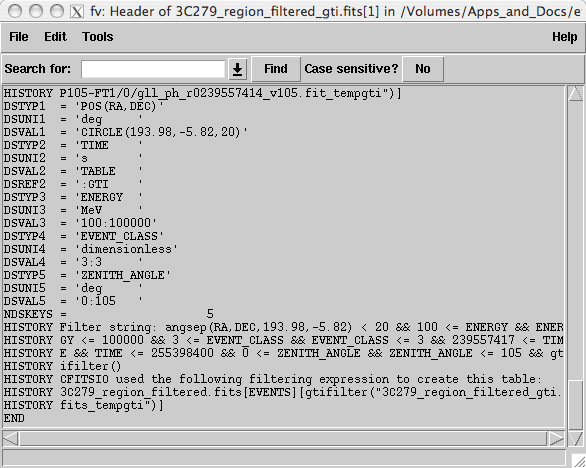
This part of the header contains information about the data cuts that were made to extract the data. These are contained in the various DSS keywords. For a full description of the meaning of these values see the DSS keyword page. In this file the DSVAL1 keyword tells us that the data was extracted in a circular region, 20 degrees in radius, centered on RA=193.98 and DEC=-5.82. The DSVAL2 keyword shows us the that the valid time range is defined by the GTIs. The DSVAL3 keywords shows the selected energy range in MeV, DSVAL shows the event class selection, and DSVAL5 indicates that a zenith angle cut has been defined.
Making a Counts Map:
 fv can also be used to make a quick counts map to see what the region you extracted looks like. To do this:
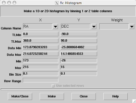
- In the summary window for the FITS file, click on the Hist button for the EVENTS extension. A Histogram window will open.
Note: We use the histogram option rather than the plot option, as that would produce a scatter plot.
- From the X column's drop down menu in the column name field, select RA.
fv will automatically fill in the TLMin, TLMax, Data Min and Data Max fields based on the header keywords and data values for that column. It will also make guesses for the values of the Min, Max and Bin Size fields.
- From the Y column's drop down menu in the column name field, select DEC from the list of columns.
- Select the limits on each of the coordinates in the Min and Max boxes.
In this example, we've selected the limits to be just larger than the values in the Data Min and Data Max field for each column.
- Set the bin size for each column (in the units of the respective column; in this case , degrees).
 For this map, we've selected 0.1 degree bins.
 - You can also select a data column from the FITS file to use as a weight if you desire.
For example, if you wanted to make an appoximated flux map, you could select the ENERGY column in the Weight field and the counts would be weighted by their energy.
- Click on the “Make” button to generate the map.
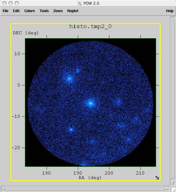
This will create the plot in a new window and keep the histogram window open in case you want to make changes and create a different image. The "Make/Close" button will create the image and close the histogram window.
fv also allows you to adjust the color and scale, just as you can in ds9. However, it has a different selection of color maps.
As in ds9, the default is gray scale. The image at right was displayed with the cold color map, selected by clicking on the "Colors" menu item, then selecting: "Continuous" submenu --> "cold" check box.
Making 1D Histograms
Making a 1D histogram is similar to making the counts map, except that you only select one column to plot instead of two. In this example, we will take a quick look at the light curve of the gamma ray burst data we extracted.
Start by opening the grb_events.fits file with fv:
prompt> fv grb_events.fits &
This brings up a File summary window that looks like:
Note that there were a total of 1102 events in the 2000 second time window we extracted.
To make a lightcurve for this data:
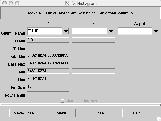
- Click on the "Hist" button for the EVENTS extension to bring up the histogram window.
- In the X column, click on the drop down box and select TIME. (You will need to scroll down in the pull-down list to find the TIME field).
- Fill in the Min and Max fields for the start and stop time you want the plot to cover.
In this case, since we want to look at the entire time range, we select Min and Max values just larger than the time range covered by the file.
- Set the size of the time bins you want to use; in this case, we selected 10 second bins.
- Finally, click on the Make button to create the image.
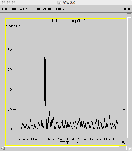 This generates the image shown on the right. The burst stands out quite nicely in this image as a spike above the typical background rate of ∼ 5 photons.
Note: fv also allows you to zoom in by simply clicking on the window and dragging the cursor to enclose the region you wish to zoom in on.
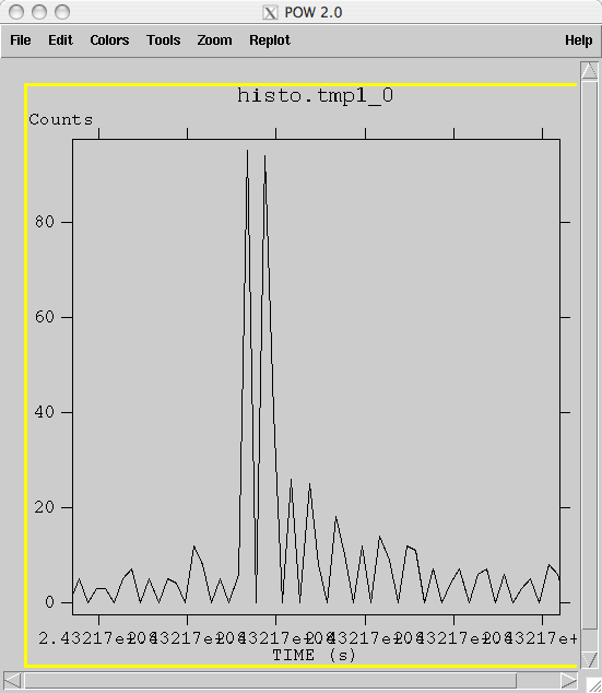 For example: By zooming in on the narrow region close to the burst we get the image below which shows a possible double-peaked structure followed by a period of excess events above background levels.
Looking at the Raw Data
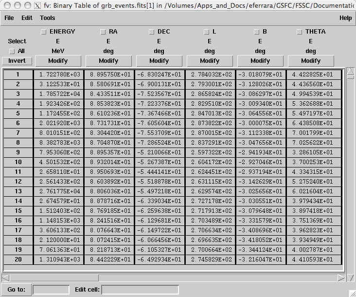 fv also allows you to simply look at the raw data from the file in tabular form.
To see the data, click on the All button for the extension you want to view.
This will bring up a window similar to the one on the right (which is the data from the grb_events.fits file). In this window you can scroll through the data and look at specific values in the various rows and columns.
From this window you can also:
- Create histograms
- Add/delete rows/columns
- Make selections on the data
- Edit values as needed.
Caution: You have complete access to edit the data, so be careful.
2. Binning the Data
While ds9 and fv can be used to make quick look plots when exploring the data, they don't automatically do all the things you would like when making data files for analysis. For this, you will need to use the Fermi-specific gtbin tool to manipulate the data.
You can use gtbin to bin photon data into the following representations:
- Images (maps)
- Light curves
- Energy spectra (PHA files)
This has the advantage of creating the files in exactly the format needed by the other science tools, as well as by other tools such as XSPEC; and of adding correct WCS keywords to the images, so that the coordinate systems are properly displayed when using images viewers (such as ds9 and fv) that can correctly interpret the WCS keywords.
In this section we will use the 3C279_region_filtered_gti.fits and grb_events.fits files to make images, and raw count ligthcurves using gtbin, and will look at the results with fv and ds9.
Images
Just as with fv and ds9, gtbin can be used to make counts maps out of the extracted data.
The main advantage of using gtbin is that it adds the proper header keywords, so that the coordinate system is properly displayed as you move around the image. Here we'll make the same image of the anti-center region that we make with fv and ds9, but this time we'll use the gtbin tool to make the image.
gtbin is invoked on the command line with or without the name of the file you want to process. If no file name is given, gtbin will prompt for it. Here it is the input and output from running the task:
prompt>  gtbin

This is gtbin version ScienceTools-v9r17p0-fssc-20100630

Type of output file (CCUBE|CMAP|LC|PHA1|PHA2) [] CMAP

Event data file name[] 3C279_region_filtered_gti.fits

Output file name[] 3C279_region_cmap.fits

Spacecraft data file name[] NONE

Size of the X axis in pixels[] 400

Size of the Y axis in pixels[] 400

Image scale (in degrees/pixel)[] 0.1

Coordinate system (CEL - celestial, GAL -galactic) (CEL|GAL) [CEL]

First coordinate of image center in degrees (RA or galactic l)[] 193.98

Second coordinate of image center in degrees (DEC or galactic b)[] -5.82

Rotation angle of image axis, in degrees[0.]

Projection method e.g. AIT|ARC|CAR|GLS|MER|NCP|SIN|STG|TAN:[] AIT

prompt>
There are many different possible projection types. For a small region the difference is small, but you should be aware of it.
 When you start the tool, gtbin first asks which type of output you want.
In this case, we want a counts map so we:
- Select CMAP.
- Provide an output file name.
- No spacecraft file is needed for the counts map, so we specify NONE.
- Input image size and scale in pixels and degrees/pixel.
Note: We select a 400x400 pixel image with 0.1 degree pixels in order to create an image that contains all the extracted data.
- Enter the coordinate system, either celestial (CEL) or galactic (GAL), to be used in generating the image. The coordinates for the image center (next bullet) must be in the indicated coordinate system.
- Enter the coordinates for the center of the image, which here correspond to the position of 3C 279.
- Enter the rotation angle (0).
Here is the output counts map file to use for comparison.
Compare this result to the images made with fv and ds9 and you will notice that the image is flipped along the x-axis. This is because the coordinate system keywords have been properly added to the image header and the Right Ascension (RA) coordinate actual increases right to left and not left to right. Moving the cursor over the image now shows the RA and Dec of the cursor position in the FK5 fields in the top left section of the display.
If you want to look at coordinates in another system, such as galactic coordinates, you can make the change by first selecting the 'WCS' button (in the first row of buttons), and then the appropriate coordinate system from the choices that appear in the second row of buttons (FK4, FK5, IRCS, Galactic or Ecliptic).
The CCUBE (counts cube) option produces a set of count maps over several energy bins.
- Enter the projection method for the image. See Calabretta & Greisen 2002, A&A, 395, 1077 for definitions of these projections.
gtbin can also be used to generate light curves of the data you extracted. Note, this procedure produces raw counts lightcurves which have not been corrected for exposure variations or the presence of background events. Here is the input to generate a light curve of the extracted burst data:
prompt>gtbin

This is gtbin version ScienceTools-v9r17p0-fssc-20100630

Type of output file (CCUBE|CMAP|LC|PHA1|PHA2) [] LC

Event data file name[] grb_events.fits

Output file name[] grb_lc.fits

Spacecraft data file name[] NONE

Algorithm for defining time bins (FILE|LIN|SNR) [] LIN

Start value for first time bin in MET[] 243216266

Stop value for last time bin in MET[] 243218266

Width of linearly uniform time bins in MET[] 10

prompt>
Notes:
- In this case, we chose the lightcurve (LC) option when prompted for the type of output file, then entered the name of the output file; a spacecraft file is not needed.
- When asked for the algorithm for defining the time bins, choices were bins defined in a file (FILE), linear bins (LIN), or bins with equal signal-to-noise ratios (SNR).
In this case, the linear option was chosen.
For details of how the other options work, refer to the reference page for gtbin.
- Next are prompts for the start and stop time of the bins to be generated.
- And finally, since linear was selected, gtbin prompts for the width of the bins in seconds; here we selected 1 second bins.
- The resulting lightcurve is simply the total number of counts per time bin contained in the input file. No exposure effective correction is applied (see the gtexposure tool).
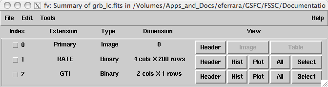
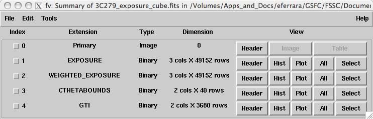
Since the output is not an image, but rather a table of values, we will look at it with fv instead of ds9. Below is the fv summary window for the grb_lc.fits file.
Note that the main data extension, RATE, has four columns and 200 rows.
Click on the 'All' button for the RATE extension.
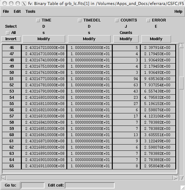 A window listing the values of the three columns will be displayed. [In this case we've scrolled down to the location of the burst (starts at the line with 94 events).]
From this window we see that the four columns are TIME, TIMEDEL, COUNTS and ERROR:
- TIME -- Contains the midpoint of the time bin.
- TIMEDEL -- Contains the width of that particular bin.
Since linear bins were used, this value is 10 seconds for all bins. Had the FILE or SNR option been used, these values would reflect the size of the bins used.
- COUNTS -- The number of events that fell into that time bin.
- ERROR -- Counts error where: if (number of counts) <= 10, then stat_err=sqrt(counts+0.75). Else, if (number of counts) > 10, then stat_err=sqrt(counts).
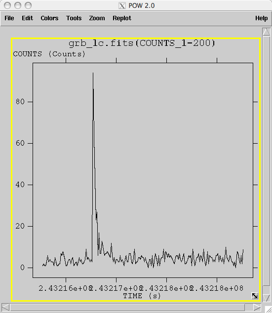
To look at the light curve produced, plot the TIME column against the COUNTS column:
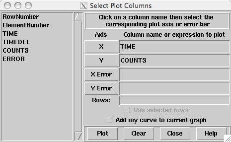
- Click on the 'Plot' button in the summary window in the RATE extension line.
The window shown to the right will be displayed. From the list in the left pane, click on the column you want to plot. In the right pane, click on the axis you want it to appear in.
- To plot the counts versus time, first click on the TIME column, then the X axis button.
This will put the TIME column in the field next to the X button.
- Click on the COUNTS field in the left pane and the Y button in the right pane.
- Click on the 'Plot' button.
A plot of the light curve will be displayed. As you can see below, the gtbin lightcurve does not confirm the double-peaked structure seen in the lightcurve produced by fv.
Note: As in the example on making 1D histograms with fv, you can zoom in on any particular part of the image by drawing a selection around that part of the image with the mouse.
3. Looking at the Exposure
In this section, we explore ways of generating and looking at exposure maps. If you have not yet run gtmktime on the data file you are examining, this analysis will likely yeild incorrect results. It is advisable to prepare your data file properly by following the Data Preparation tutorial before looking in detail at the livetime and exposure.
Generally, to look at the exposure you must:
- Make an exposure cube from the spacecraft data file using gtltcube.
- As necessary, merge multiple exposure livetime cubes covering different time ranges.
- Create the exposure map using the gtexpcube tool.
- Examine the map using ds9.
Calculate the Livetime
In order to determine the exposure for your source, you need to understand how much time the LAT has observed any given position on the sky at any given inclination angle. gtltcube calculates this 'exposure cube' for the entire sky for the time range covered by the spacecraft file. To do this, you will need to make the exposure cube from the spacecraft (pointing and livetime history) file, using the gtltcube tool. Here, we create an exposure cube for the region surrounding 3C 279.
prompt> gtltcube

Event data file [] : 3C279_region_filtered_gti.fits

Spacecraft data file [] : spacecraft.fits

Output file [] : 3C279_exposure_cube.fits

Step size in cos(theta) (0.:1.) [] :0.025

Pixel size (degrees) [] : 1

Working on file spacecraft.fits

.....................!

prompt>
Notes:
- Some values such as "0.1" are known to give unexpected results for "Step size in cos(theta)". Use 0.099 instead.
- Entries include:
- Name of the event data file, and the spacecraft file to use
The event file is needed to get the time range over which to generate the exposure cube.
- Output file name
- Size of the bins to use in accumulating the livetime (defaults are typically sufficent)
- Name of the event data file, and the spacecraft file to use
To generate an exposure map using multiple exposure cubes:
In some cases, you will have multiple exposure cubes covering different periods of time that you wish to combine in order to examine the exposure over the entire time range. One example would be the researcher who generates weekly flux datapoints for lightcurves, and has the need to analyze the source significance over a larger time period. In this case, it is much less CPU-intensive to combine previously generated exposure cubes before calculating the exposure map, than to start the exposure cube generation from scratch. To combine multiple exposure cubes into a single cube use the gtltsum tool.
Note: gtltsum is quick, but it does have a few limitations, including:
- It will only add two cubes at a time. If you have more than one cube to add, you must do them one at a time.
- It does not allow you append to or overwrite an existing exposure cube file.
For example if you want to add four cubes (c1, c2, c3 and c4), you cannot add c1 and c2 to get cube_a, then add cube_a and c3 and save the result as cube_a, you must give it a different name.
- The calculation parameters that were used to generate the exposure cubes (step size and pixel size) must be identical between the exposure cubes.
Here is an example of adding two exposure cubes from the first and second halves of the six months of 3C 279 data (where the midpoint was 247477908 MET):
prompt>  gtltsum


Livetime cube 1 or list of files[] 3C279_region_first_expcube.fits

Livetime cube 2[none]  3C279_region_second_expcube.fits

Output file [] : 3C279_region_summed_expcube.fits

prompt>
Generate an Exposure Map
Once you have an exposure cube for the entire dataset, you need to run the gtexpmap tool to generate the exposure map for your dataset. gtexpmap allows you to control the exposure map parameters, including:
- Map center, size, and scale
- Projection type (selection includes Aitoff, Cartesian, Mercator, Tangential, etc.; default is Aitoff)
- Energy range
- Number of energy bins
The following example shows input and output for generating an all sky Aitoff map of the exposure for the 3C 279 data file.
prompt>  gtexpmap

The exposure maps generated by this tool are meant

to be used for *unbinned* likelihood analysis only.

Do not use them for binned analyses.

Event data file[] 3C279_region_filtered_gti.fits

Spacecraft data file[] spacecraft.fits

Exposure hypercube file[] 3C279_exposure_cube.fits

output file name[] 3C279_exposure_map.fits

Response functions[] P6_V3_DIFFUSE

Radius of the source region (in degrees)[] 25

Number of longitude points (2:1000) [] 500

Number of latitude points (2:1000) [] 500

Number of energies (2:100) [20] 20

The radius of the source region, 25, should be significantly larger

(say by 10 deg) than the ROI radius of 20

Computing the ExposureMap using 3C279_exposure_cube.fits

....................!

prompt>
You are prompted for the:
- Name of an events file to determine the energy range to use.
- Name of the exposure cube file to use.
- Name of the output file and the instrument response function to use.
For more discussion on the proper instrument response function (IRF) to use in your data analysis, see the overview discussion in the Cicerone, as well as the current recommended data selection information from the LAT team. The LAT data caveats are also important to review before starting LAT analysis.
- The next set of parameters specify the size, scale, and position of the map to generate.
- The radius of the 'source region'
The source region is different than the region of interest (ROI). This is the region that you will model when fitting your data. As every region of the sky that contains sources will also have adjacent regions containing sources, it is advisable to model an area larger than that covered by your dataset. Here we have increased the source region by an additional 5 degrees. Be aware of what sources may be near your region, and model them if appropriate (especially if they are very bright in gamma rays).
- Number of longitude and latitude points
- Number of energy bins that will have maps created
This number can be small (∼5) for sources with flat spectra in the LAT regime. However, for sources like pulsars that vary in flux significantly over the LAT energy range, a larger number of energies (10-20) is recommended.
Note: These maps are mono-energetic, and represent the exposure at the midpoint of the energy band, not integrated over the band's energy range.
Once the file has been generated, it can be viewed with ds9. When you open the file in ds9, a "Data Cube" window will appear, allowing you to select between the various maps generated.
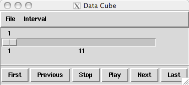
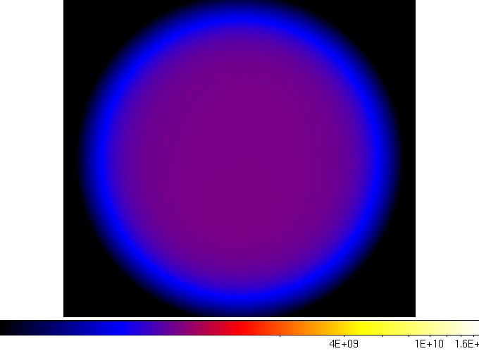
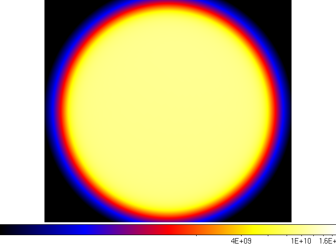
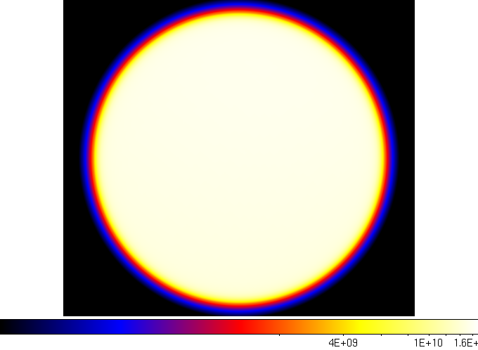
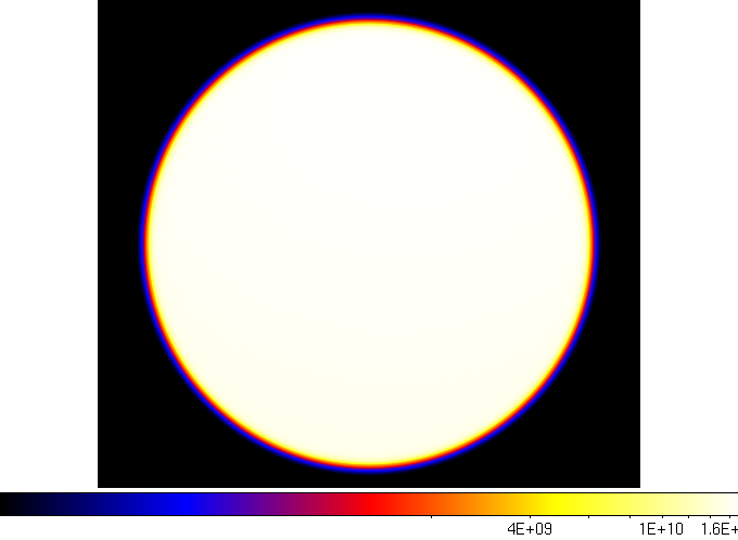
Below are four of the 20 layers in the map, extracted from ds9. As you can see, the exposure increases as you go to higher energies. This is primarily due to the increase in the effective area of the LAT instrument, as described on the LAT performance page.
|
First Layer
|
Fourth Layer
|
|
Seventh Layer
|
Tenth Layer
|
Last updated by: Elizabeth Ferrara 08/16/2010